77%
of mobile banking users surveyed struggled with their apps, mostly with navigation and jargon.
User-Centric Design of UI for Mobile Banking Apps, 2026
An AI-powered neobank that reduces financial overwhelm instead of adding to it.
I focused on three moments where banking apps create the most effort: a crowded home screen, forgotten subscriptions, and spending categories people stop trusting.
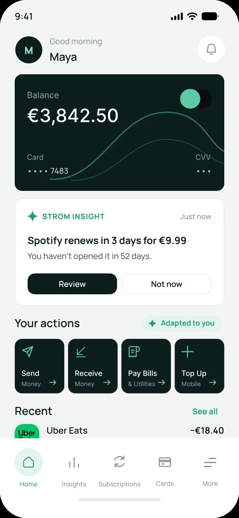
The problemEvery feature competes for the first screen, so daily tasks get buried.
SolutionOne insight and the four actions each person uses most, with the reason for the order.
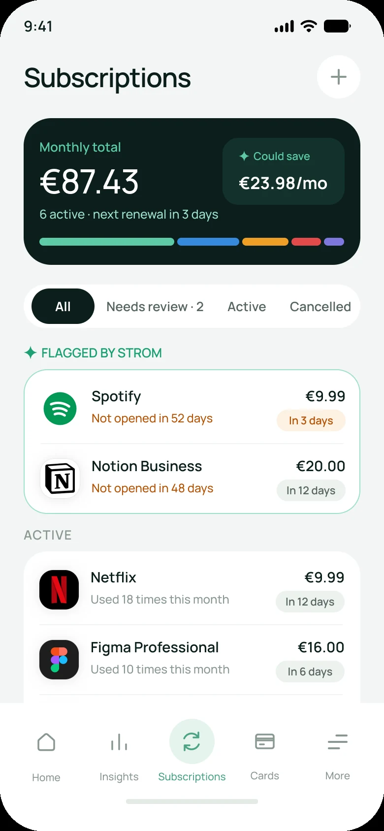
See how it works Subscription creepThe problemPeople notice a renewal on their statement, after the money has gone.
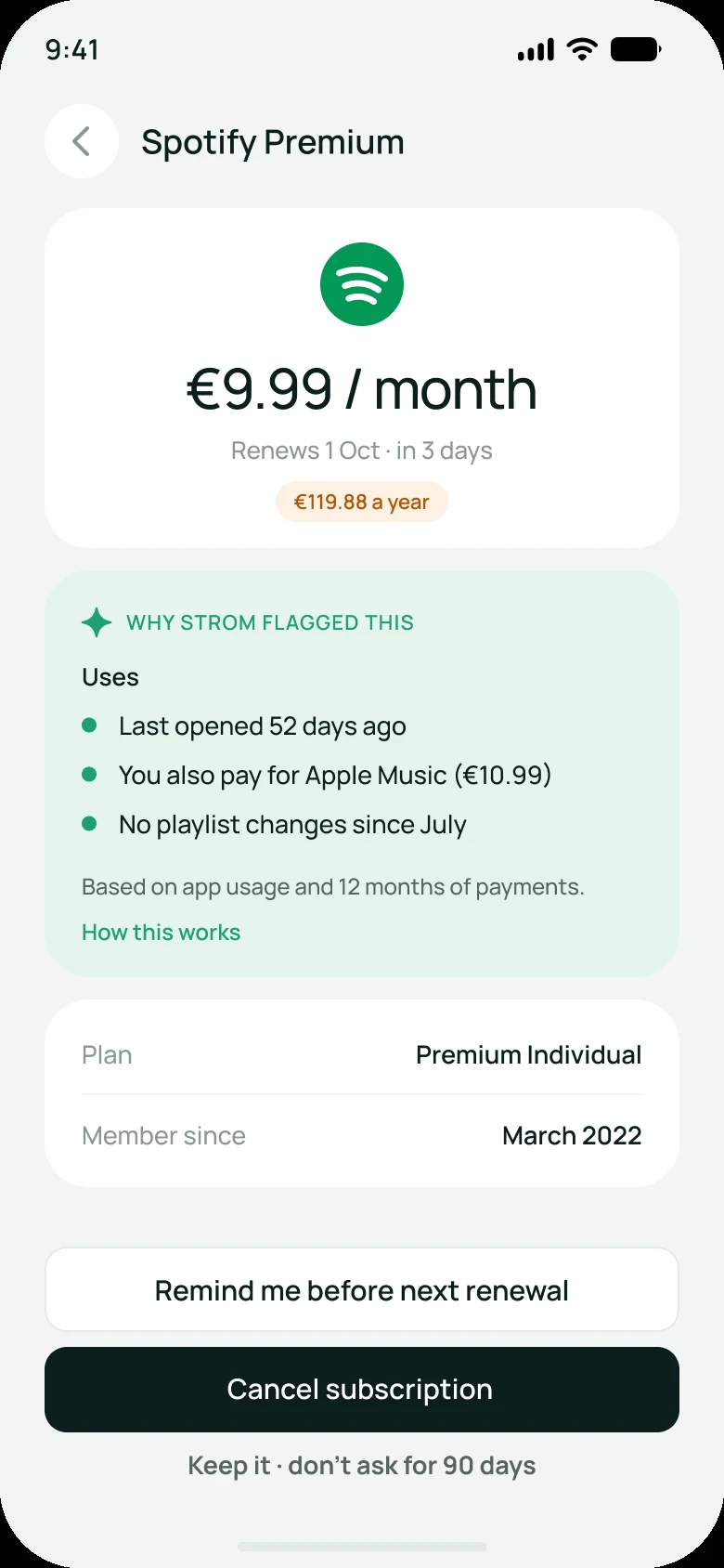
SolutionThree days before a renewal: how much the service is used, and keep, remind or cancel.
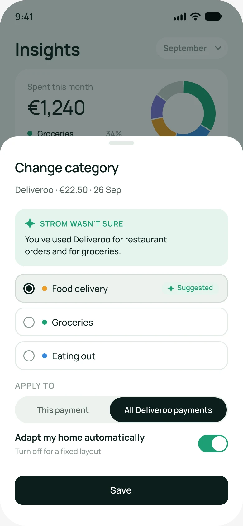
See how it works CategorisationThe problemPayments land in the wrong category, so people stop trusting the spending chart.
SolutionEvery category shows its reason. Strom asks when unsure and learns from one correction.
See how it worksNeobanks now bundle payments, budgeting, subscriptions, savings and investing into one app. Each addition makes sense alone. Together they create three points of friction.
of mobile banking users surveyed struggled with their apps, mostly with navigation and jargon.
User-Centric Design of UI for Mobile Banking Apps, 2026
of UK adults signed up to a subscription by accident within a year.
Citizens Advice
of payments got the wrong category from a typical engine, in a test of 5 million.
MX, vendor-run benchmark of categorisation engines
I reviewed Revolut, Wise, Monzo, N26 and Bleap against the three problems. The full benchmark is on the research board in FigJam.
The few things people open the app for get buried under everything else the bank wants to sell.
Decisions take longer as choices grow in number and complexity.
Surface the relevant action at the right moment and let the rest wait.
Some complexity can't be removed, only moved.
Finance stays complex. My job is to decide where that complexity lives: in front when needed, a step away otherwise.
Ranking actions by behaviour could make everyday tasks faster without hiding a thing.
Apps announce a renewal, then leave people to work out alone whether it's still worth paying for.
A system has to respond in time to keep people in flow.
Help has to arrive before the charge, while there is still time to act.
People judge an experience by its most intense moment and its end.
Prevent the surprise, and design the end of the flow as carefully as the start.
Apps say "Your subscription renews in 3 days" and stop. Do I still use it? Is there a cheaper option? People do every step alone:
A well-timed, reasoned prompt before renewal could prevent most unwanted charges.
Apps rarely say why a payment landed in a category, so one wrong label undermines the whole chart.
People expect products to work like the ones they already know.
Categories should improve with use, so each merchant only needs one fix.
Be flexible in what you accept, clear in what you return.
Accept messy merchants like Uber Eats or Amazon, and return a category with its reason and a way to fix it.
Apps rarely say why a category was chosen or whether a correction will stick. People keep the data clean on their own:
Explaining each category and learning from corrections could make the spending chart trustworthy again.
A proto-persona built from the research above, to be checked in interviews.
Account manager in Amsterdam · one neobank as her main account
"I only look at my spending when something already feels wrong, and then I'm not sure the chart is right."
When I open the app for a specific task, I want the action I need right there, so I don't scan past features I never use.
When a subscription is about to renew, I want to hear in time to decide, so I can keep or cancel before the money leaves.
When I correct a category once, I want it remembered for that merchant, so I can trust my spending without double-checking.
How might AI take work off people in their banking app, without taking control away from them?
My goal was never to add AI to a banking app. It was to find the few moments where AI takes work off the user, and to design only those.
I set these rules before designing any screen. Each capability comes with a limit it can't cross.
With AI off, it's still a complete bank. Every AI feature has its own switch, and Home falls back to a fixed layout.
The same five tabs people know from other banks. AI works underneath them instead of getting its own tab.
In every flow, the AI does the routine work, hands the user the decisions that matter, and learns from what they choose.
Greyscale on purpose, to get structure and AI behaviour right before visual style.
Strom means stream. Deep teal carries the brand, mint and a sparkle mark everything the AI produces. Click a screen to see it large.
Amber marks time-sensitive renewals, violet marks decisions waiting for the user. Manrope throughout, chosen for its clear numerals.
The persona and hypotheses come from secondary sources and a benchmark. They point in a direction but haven't been validated.
Confidence levels, detection accuracy and data access are assumed. Real engineering limits would change some interactions.
Subscriptions alone could fill a product. I went deep on three problems rather than covering the whole bank.
Nothing here has been measured yet. This is what I would test in a pilot, against the current app.